Tuesday, January 31, 2017

Jean Michel Basquiat


This piece is called "Jawbone of an Ass," made in 1982. I chose it because I thought it looked different. I like how on the left is pictures of royalty and status, and how on the right is pictures of battle and war. In the middle there are a bunch of names of famous figures in history that dealt with greatness and chaos. The top says "jawbone of an ass" which I'm assuming refers to a story in the bible that deals with chaos. All in all I think it is a very different piece of art and I am sure there is even more symbolism and meaning behind it than I realize.

Jean Michel Basquiat

     
      I chose this piece titled "50 cent Piece" because of how much is going on at once. Not only is the piece composed of different images from people, to objects, to words, but Basquiat also used a wide variety of media in this piece. He used acrylic, charcoal, crayon, pastel and pencil in order to create this piece. The words and images on the drawing are also of a wide variety from pop culture references to history. There is no doubt that there is a lot going on in this piece but that is what makes it so captivating. Whether Basquiat does it deliberately or not, his pieces cause the viewer to stop and stare for a while in order to take in each part that makes up the entire drawing. Basquiat is truly a unique artist because all of the different media and subject matter he puts into this piece

Jean Michel Basquiat

The image I chose from Jean Michael Basquiats artwork is the image Gravestone which was created in 1987. I feel this piece is really powerful and I like the fact he chose vibrant colors, but they fade into the colors of the wood he used for the art. I also feel the choice of using wood was interesting and unexpected, especially considering the piece is called Gravestone. I also find it ironic that this piece with it's ominous name referencing death came out a year before he died of his overdose, which I feel like makes the piece so much more beautiful and captivating. 

-Megan McCarthy

Jean Micheal Basquiat


                Jean Micheal Basquiat is the true definition of a real artist. His art work is just so unique in many ways. Unlike other artist who have a real drawing technique, he draws mostly stick figures or human like figures, but its so engaging to look at. I chose this specific drawing because I feel it's expressing many mixed messages. I first think its a gang affiliated piece because of the colors that are used and the fact that there are crowns all over the picture.  Not only for that reason, but he draws his human like figure with a sword in his hand and he uses the color red to express blood and anger. My second thought is that the human like figure is  him and it's expressing his own triumph in the world. Something that stands out about his art work is that he doesn't only express himself through his drawings , but his writing in his art work. The words he would write have a bigger meaning in it's self. He will constantly uses words to describe what was going on in the society around his time and his opinion on it. He leaves me at the edge of my seat wanting to see more of his art pieces because he is that great !

Basquiat Art

Looking through his work I definitely thought it was chaotic yet moving. Most of his work left me speechless. I really liked this piece on black history because when you look closely, there is a story he  is telling. To me, I feel like Basquiat intentionally made his art difficult and complex so that people can make their own sense of it. I would have really liked to know his method (if he had any) behind the madness. 

Bird on Money

"Bird on Money" was created by artist Jean-Michel Basquiat in 1981 using acrylic and crayon on a 167.5x228.5 cm canvas. The bird in the painting is actually one of Basquiat's idols, jazz musician, Charlie Parker who goes by the nickname "chicken". The words PARA MORIR (to die) and GREEN WOOD are visible and refer to the local cemetery near where Jean-Michel was raised and eventually laid to rest. Sources say the artist was trying to paint what jazz sounded like which would explain why he used blue paint, however, I do not feel as though he encompassed the full beauty of music in this rudimentary piece. While Jean-Michel Bisquiat's story is incredible, I personally am not the biggest fan of his artwork. I feel as though it is childish and all over the place which is fitting to his nickname "The Radiant Child".
american school graffiti andy city 1988

Jean Michel Basquiat Blog


I enjoy this art piece by Jean Michel Basquiat not only for his accurate depiction of a leg but for the side drawings around it. When I first saw this drawing, I thought it was supposed to represent the anatomy of the human leg since different area's are filled in with different colors and there are words/symbols around it. I noticed that the word "Heel" and "Moses' are written numerous times around the drawing which makes me wonder why that is. Also, I am curious to know why Basquait gave this drawing a specific shoe size. I have noticed that Basquiat's drawing tend to be filled with random objects/pictures but I sense some sort of relationship between all the mini pictures drawn around the main picture (for example, the clock drawn says it's a little pass 9 o'clock while his foot in the picture is a size 9).

Boxer Rebellion - 1983


This is one painting of many from the extremely talented Jean Michel Basquiat. This painting is called Boxer Rebellion, it was a canvas that he completed in 1983. I find it very intriguing that in a lot of his pieces he uses words and poems. His neo-expressionist/graffiti style work allows for his words to have a purpose. His words vary in meaning, they could say what was currently going on in society, or they could be explaining the injustices that he was facing in that time, or even just how he was feeling. Like the word in the top right corner, all of his works are pure. They are pure and raw. You could tell by the technique that he uses that there is emotion behind each detail of these works.

Jean Michel Basquiat

This painting is called "The Field Next to the Other Road," 1981. Basquiat was inspired by his trip to Italy. The painting itself is soaked in pastel beige with his trademark red and black colors. The painting was sold in New York in 2015, for $33 million. I really liked this painting because he chose to use different colors on the cow than what is normally seen. I also thought it was interesting that the person in the painting has the cow on the lease as if it they were going for a walk on the field. I was curious to know why there is a grey background behind the man and why the sun has no color? Overall, I thought this painting was unique.

Basquiat Self-Crowned King Of The Art World


I chose this piece because if no one knew who Basquiat is then they knew of his crown trademark that can be found in most of his earlier work. In the art world you can be anyone you want through your work and Jean decided he want to be on top, he wanted to be the king. This crown, as debated by many, is the symbol of Jean crowning himself. He sees himself as Majestic and though he didn't go to fancy art schools he knew the history of his field. Another thing about this crown is that it is often found in his self portraits, which is a more blatant way of crowning oneself. This crown, and living like a king sent Baquiat to the top of his era and made him a force to be recon with. After all, he did get famous for being infamous. LONG LIVE SAMO.

Jean Michel Basquiat

   This piece of art created by Jean Basquiat I find very unique. Within all the art classes I have taken I have come to realize that art has a lot to do with your own personal life story. No matter how you express art whether it be painting, drawing, sculpture, etc each person has their own way of expresses their emotions. This piece really stuck out for me because there is a lot going on and it makes you want to try and connect the pieces; it makes you want to figure out the story Jean is trying to tell his observers. The colors also work very well together, attracting the eye even more than it already has. I really find this piece to be interesting along with several other of his works; it is fun to connect the pieces of the puzzle and make out its meaning.

Monday, January 30, 2017

Basquiat: "Unknown (God/Law)"


The Brooklyn Museum recently opened up an exhibition called Basquiat: The Unknown Notebooks where many of Jean-Michel's never before seen notebook artwork was displayed. The untitled artwork above was one of the many pieces to be displayed. This piece was created in 1981 using oil sticks on paper.

Post an Image by Jean Michel Basquiat


Sunday, January 29, 2017

Blog One: Katharina Grosse


  Katharina Grosse is a different artist. She displays her talents not like the usual painting, drawing or forming objects; she is unique. All Katharina's artwork is done with a spray can. In the first picture you see Katharina needs to wear a lot of protection on her face and body to protect herself from toxic fumes from spraying the can for long periods of time; however if you notice the picture under it is her finished product. Katharina expresses a way of art in a fun and interesting way, that is very different than other artists. I enjoyed reading about her and hope to try displaying art in this way sometime during the semester.

Wednesday, January 25, 2017

Katharina Grosse


So I found that this piece was very interesting to me. It just looks like this controlled chaos and it makes you look at various places, not just one area. I like how there are unopened boxes in the corner and the unmade bed. The way the sheets are rolled up, it looks like a body. I interpreted this piece kind of like a crime scene. It made me think the back story of what could have made the mess. I like how the dark colors are all in the corner of the room and the brighter colors are towards the outside rim of the piece. Its very cluttered around the boxes and the dark colors.

Blog 1: Katharina Grosse


      I found Katharina Grosse's artwork to be very colorful and appealing to the eye. After taking a closer look at her style of portraying modern art, I was intrigued to learn about her spray-painting techniques. Grosse takes spray-painting to a whole new level, with her inclusion of several layers, dimensions, color compaction, and color combinations. I also liked the after effects of the spray paint dripping down the canvas, which gave the painting a more finished and natural look. Her paintings provided me with a sensation of looking into another world, filled with vibrancy and liveliness. I would definitely consider using spray paint as a media for my final project.

Grosse Exhibit


The medium this artist uses is what really stood out to me. Spray painting and being able to achieve the different rich colors within the paintings. The way she utilizes mainly all positive space filled with color and achieves a 3D effect is also impressive.

Katharina Grosse Two Younger Women Come In and Pull Out a Table, 2013

            This piece is acrylic on wall, latex, and PVC balloons. I chose this piece because it showed more life in it then Katharina Grosse's other pieces while still having her same art style and color pallet. These pieces look suspended in air giving it a more playful and lively feel.

Katharina Grosse

I personally love Katharina's artwork and the unconventional way they are created. Each work of art flows and drips with colors that would not usually be used together, but somehow she makes it work. For example, in this painting there are dark earth tones next to light pastels but the overall painting is easy on the eyes. I also appreciate her method of applying media as I work in a body shop restoring old cars and part of the restoration process includes using an industrial spray gun to paint a car. While drips and over-spray would be a nightmare for me when painting a car I enjoy looking at them in Katharina's artwork.
Katharina Grosse, Untitled (2016). © Katharina Grosse und VG Bild-Kunst, Bonn 2016. Photo by Jens Ziehe. Courtesy Gagosian.

Katharina Grosse

I enjoyed Katharina Grosse's body of work. I especially liked that none of her paintings had true negative space. Every inch of the canvas was taken up with bright colors that matched the subject's colors yet still allowed it to stand out. The subjects were not easily identifiable objects but you can clearly see the shapes and contours of them. Her paintings somehow seem to involve every color in a style that is unique to anything I have seen before. The paintings are all so similar but each piece has its own identity.

katharinia


I am not sure what this piece is or what it is portraying, but the colors attract all sorts of viewers. In my opinion, the colors portray an ocean and sunset scene due to how the structures move and come together. Whether you like abstract art or something with more structure, this piece really brings your eyes in to the center. The name of it"Just the two of us" is just as unstructured as the piece itself. It has no meaning that we know of but it seems to fit just well.

Blog 1: Katharina Grosse

After reading the article about Kathatina Grosse, I was completely mesmerized by her work. She uses vibrant colors that flow together asymmetrically making all of her work stand out among the rest. I enjoy what she has on display at the Gagosian, but my favorite pieces are the ones she has completed outside, using the natural land. In the article, I enjoyed her comment about her paintings not having a true time line because everything seems to have happened at once. This quality is seen  not only on her canvas paintings but also on her painted buildings and sculptures. 

Grosse's Talents

Katharine has been a working artist since 1998 and though not well known, she has made various art displays across the US, both indoor and out. I think that had to be the most interesting fact about this artist. She stated in the interview that "angles and protruding elements of buildings and spaces can block the flow of her paint spray." Which you can see in her latest pieces how a simple stencil adds a layer of dimension and corruption to the flow of colors. 

Blog 1: Katharina Grosse


While reading about German artist Katharina Grosse, I forged an increasing connection between her unique art style and the street art found throughout the world. Namely, the art was very reminiscent of the graffiti I am accustomed to seeing in New York City. Grosse's choice of using an industrial spray gun as a medium did not seem too far off from the street artist medium of choice: the paint spray-can. The intricate layers of vibrant colors create, as the article points out, a "portal-like" effect. I was deeply interested in her ability to create this, and so in choosing one of her works to display in this blogpost, I looked for a piece of art that felt the most "portal-like" to me. In this piece, my eyes were first attracted to the colorful borders reaching up along the walls. Slowly, my eyes worked inwards - and took special note of the very clear portal-like detail in the upper-left accomplished through multiple layers of color. I also appreciate this piece given her choice to paint over dirt, as discussed in the article and pictured in the upper-right. Our ability to be astounded by and appreciate this artwork tells me that we should begin to look at graffiti in a similar way - and in doing so, recognize the full worth of the art surrounding us. 

Katharina Goose

By using a spray gun Katharina Goose has been able to create amazing paintings that depict the tragedy of hurricane Katrina.  With a high contrast in colors, the piece is able to capture the eye of any viewer.  Also to be able to create pieces that you spend 3 to 4 minutes straight on without stopping the spray gun is impressive.

Blog 1: Katharina Grosse

Katharina Grosse, Untitled (2016). © Katharina Grosse und VG Bild-Kunst, Bonn 2016. Photo by Jens Ziehe. Courtesy Gagosian.

I think it's pretty unique that she uses a spray gun to "paint" rather than traditional materials. It looks graffiti-ish and the colors are vibrant. I think it is a cool medium, but I wouldn't prefer it for a landscape piece. In my opinion, I think it works well with abstract and in her 3D pieces.

Tuesday, January 24, 2017

Blog 1


     After reading the article, it is clear that Katharina Grosse has a unique take on modern art in her approach to painting structures, landscapes, sculptures, and paintings in the "traditional" sense. Her canvas paintings in her gallery show layering of different vibrant colors that close up seem very complicated to form but as a whole make the painting come together. After reading about how Grosse painted different houses that were abandoned or destroyed I knew I needed to see images in order to understand better. Her use of different surfaces makes her very unique as an artist. There is street art everywhere, but rarely are there abandoned buildings painted over with spray guns. Her approach to painting over dirt is also an interesting use of media and probably a first. I'm also sure that painting in a full-body suit has to be an enjoyable job. I'm interested to see what work she produces in the future since she can paint on houses, dirt, and trees, her possibilities will be endless. 

Katharina Grosse

My first thought while reading about her art was how impressive it was that she makes such beautiful pieces with an industrial spray gun, because i feel that that is a hard tool to use to create art. I'm interested in how she layers her paints on the canvas but still manages to make it look extremely neat and perfectly placed. The use of the colors is so vibrant and eye catching and the patterns make you not want to look away. I really like her works, but I really enjoyed the untiled painting from 2011 pictured below. I feel like it has so much movement and life in the simple pattern of the painting. It adds so much dimension on the canvas.  I also like her thought process of making a filter with foam and cardboard to use as a stencil.

untitled / 2011 / acrylic on canvas / 240x388 cm


-Megan McCarthy

Grosse-Confusion & Chaos


Grosse, I must say is a phenomenal artist with a very unique eye for color and technique. First I would like to comment on how her works are all vibrant mixtures that seems to go together and against each other simultaneously. However, the colors some how overlap each other almost like a trap. Such style is also reminiscent of graffiti and street art. In contrast, most graffiti art tends to have a particular aim weather it's a message, word or even a mood of some sorts. For Grosse, I get the feeling of confusion and chaos which, may are may not be her aim. In essence, I would have to experience this art live to get more understanding, but I definitely appreciate her work. 


Blog 1 - Katharina Groose


          While reading about Katharina Grosse, I was immediately brought back to my home town in Queens. Katharina Grosse expresses her art through the industrial spray gun which reminded me of the street art I see when I walk down certain neighborhoods back home. Spray painting is expressed best through multiple colors and that is exactly what Katharina Grosse uses. Back home when people use spray paint at any time it is seen as graffiti, but Katharina Grosse brings spray painting to light in a different way. When people see her work they see it as art and nothing more. What I love most about her work is that when looking at her work you are not sure what is , but that is the beauty of it . She is constantly using such vibrant colors and that allows her art to stand out from others. Not only does she use vibrant colors, but the patterns that she uses in her art are just fascinating. She is constantly using thick vertical lines in her art. Although, I am not a fan of lines or stripes, the way she presents the lines in her art caught my attention instantly. I am not sure what it is about the patterns that I love , but they are so pleasing to stare at and her art work leaves me wanting to see more. Her art work is just so beautiful and has a unique component to it that I don't see very often.  

Blog 1

This is one of Katharina Grosse' works of art that is shown in her new exhibition of painting with a spray gun. I thought this piece was very unique and different from the other paintings in her exhibition. From what I've seen most of the paintings were on canvases, and here she created a metal sculpture. I liked how the sculpture had abstract with the white slices; sharp edges of color, and overlapping sprays and paint drips. I really liked how theses techniques gave the sculpture dimension and texture. I also liked how Grosse used rainbow colors. I thought it was interesting to find out that she doesn't use a paintbrush. However in the article, it mentioned she used stencils to help her. Overall, I thought Grosse' work was beautiful and unique.  

Katharina Grosse


Katharina Grosse’s unique style of art is very interesting to me. Her process in creating such art is so different with such unique objects in her work really intrigue me. In this picture she used fallen trees, but in other works I’ve seen her use couches, benches, Styrofoam, cardboard, etc to alter the final look of the painting. The fact that she takes these random objects and transforms them into vibrant, beautifully colored pieces of art just amazes me. Similar to what was mentioned in the article, seeing how the the objects  can completely transform the angles and direction of her spray give this work so much dimension and depth. I believe I enjoy her larger scale works more than the smaller canvas. Either or, Grosse's works sure know how to make an impression in a gallery with her bold, bright, beautiful colors.

Blog 1- Katharina Grosse


Katharina Grosse Ikon 2002
Reading about Katharina Grosse reminded me a lot of street art that one may often see in NYC. Katharina Grosse paints using spray cans which truly is an art in itself. The first thing that came to my mind when reading about her pieces of arts were, "how could she possibly breathe while she creates her artwork?!" Nonetheless, Katharina Grosse has made many beautiful and vibrant pieces that makes you wonder how she blends the different colors in so well and know what layer each color should be. The art piece above was done by Katharina Grosse and it is seen at the Ikon Gallery. The colors are acrylic and were applied using a spray gun. To me, this art piece looks like giant bursts of organized colors that really light up a room.

Thursday, January 19, 2017


This is a series of drawings by Jill Slaymaker.


Syllabus

Syllabus


Mount Saint Mary College
Studio Art: Modern Approach to Making Art

Course Number:       ART 4016                                                       Credits:           3
Course Title:              Studio Art: Modern Approach to Making Art
Professor:                   Gary Jacketti
Office Hours:             Monday, Wednesday before or after class
e-mail:                        
                                    gjac4166@my.msmc.edu
Class Times:               Monday/Wednesday 5:15 to 6:40
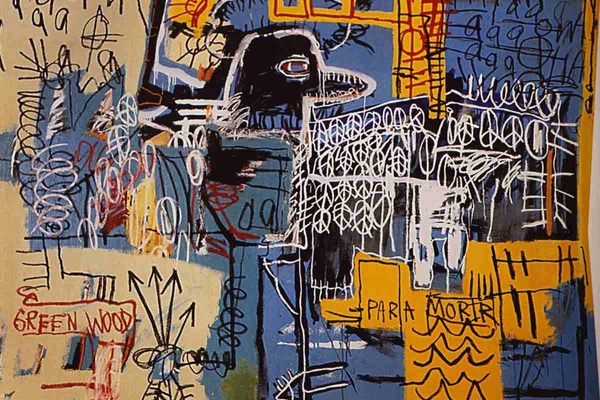
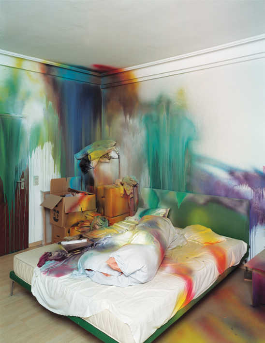
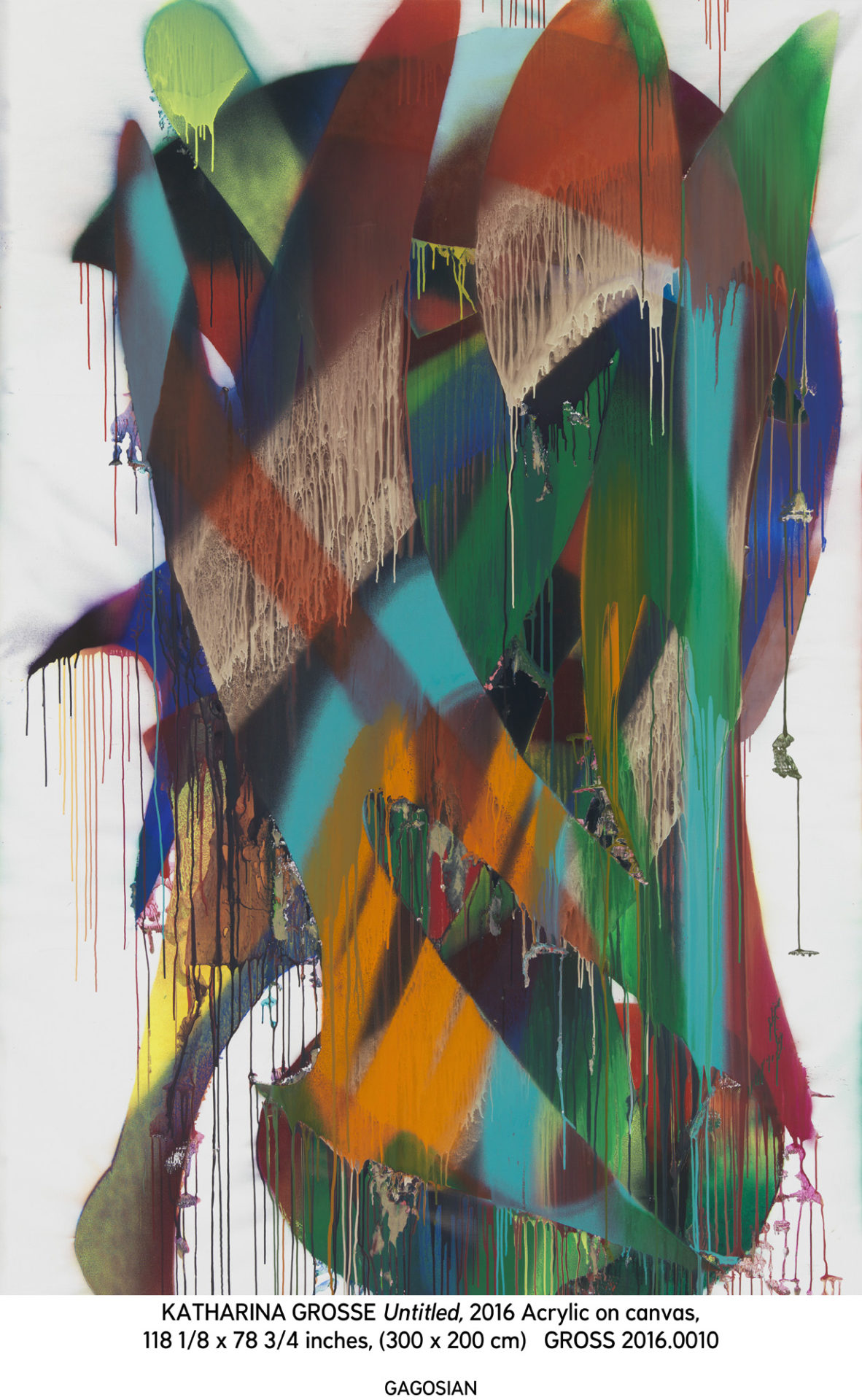
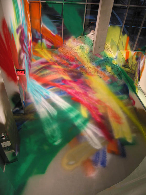
Course Outcomes:     The objective of this course is to investigate the development of personal expression through a variety of mediums.  The course will examine the importance and impact of media on works of art.  The students will consider and utilize the various media and techniques employed by artists through history.  The student will be challenged to implement, experiment and devise new and unexplored media in contemporary art.

Grading and Evaluation
Students will need to complete 2 major projects.  They will also present accompanying studies and intellectual research to substantiate these projects.   Attendance is mandatory.  Three unexcused missed classes will result in the dropping of the letter grade by 1, 5 absences the grade will be lowered by 2.  I will evaluate the content as follows:

Mid-Term Project 30%
Social Media  15%
Related Studies  25%
Culminating Final Project  30%

Division of Arts and Letters Grading Policy
Points
Grade Equivalent
Quality Points
Meaning
100-95
A
4.0
Superior
94-90
A-
3.67
Outstanding
89-87
B+
3.33
Excellent
86-83
B
3.0
Very Good
82-80
B-
2.67
Good
79-77
C+
2.33
Above Average
76-73
C
2.0
Average
72-70
C-
1.67
Below Average
69-65
D+
1.33
Poor
64-60
D
1.0
Passing
59-0
F
0.0
Failing

Blog

Social Media
You will be responsible for a weekly social media post.  It may be assigned or can be related to your personal avenue of expression.  Historical and contemporary artists should be used as influence and inspiration.

Critiques

Your finished major projectss will be looked at and discussed critically with your peers. Attendance and participation is mandatory.  This is one of the most important tools artists use to help reflect and improve their work.  I will be available for one private critique for each project to be scheduled during the semester.

Minor Works and Studies

These studies will consume a great amount of studio time during the semester.   They will be used to explore and solidify aesthetic thoughts and processes related to the final 2 major projects.

Mid Term and Final Project

These projects will be of the students choice and the student should give thoughtful consideration to them.  They will take a longer period of time to complete than the minor works and studies

Week 3

Presentation of concept for mid-term project

Week 6 and 7

Personal Critiques for midterm project                                                          
                                                                           
Week 8

Mid Term Critique

Week 10

Presentation of concept for final project

Week 13 and 14

Personal Critiques for final painting

Week 15

Final Critique